Challenge Coin Design That Makes One Story Stand Out
Time : Oct 30, 2026 View : 30
A commemorative item usually features a certain date. It might show a famous building and a short, memorable phrase. The main problem starts when people put every single idea onto the final product. As a result, the main building gets too small. A long motto might squeeze tightly along the outer edge. At that point, the special marks of the event become hard to see. Through careful challenge coin design, one truly important feature gets plenty of space. It stands out clearly. The other parts just explain why that main feature matters.

A detail that belongs to this occasion
Certain details make an item special and worth making. Think about a planned anniversary medal for an old railway station. A normal train just shows rail travel. But the station’s unique clock tower points to one exact spot. Because of this, the tower acts as a great main picture. It perfectly matches the special event.
For unique custom challenge coins, real creativity usually comes from picking that exact subject. An unusual shape also works as a pick. This works great if the shape links well with the main picture. A border shaped like a tower supports the whole station idea. On the other hand, a star border brings in a totally different thought. Because of that, the drawing then carries that new thought as well.
Two sides give the story more room
The back side holds parts that could crowd the main picture. In our station example, a large tower goes on the front. At the same time, the opening date and party text fit nicely on the back. Turning the item over reveals new visual parts. Imagery across two sides forms a cohesive visual narrative. Plus, the same design avoids getting stuffed onto every side.
The date shows exactly when the event happened. A short phrase explains the exact party. For custom commemorative coins, this method gives every single word a clear job. Words added just for looks take up useful space. They do this without giving any helpful background.
The drawing takes on depth in metal
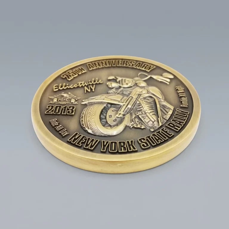
A single drawing looks very different with a special surface finish. On normal paper, flat lines show the clock tower. In a carved form, real height and shadows play big parts. A dedicated tooling die is produced for each custom order, and prototype samples with artwork revisions are built into the process. For a metal item, the normal making process follows a few set steps. Production follows a standardized sequence: artwork development, mold development & confirmation, metal processing, polishing, vibratory deburring, electroplating, enamel coloring or epoxy coating, initial quality inspection, protective spray coating, secondary inspection, packaging and shipment. Multiple stage inspections cover incoming materials, in process production and finished goods before dispatch.
Relief brings out the main feature
With raised features, the main tower sits higher than the flat base. On 3D items, sloped sides bounce light in unique ways as the object turns. These real shapes outline the roof very clearly. At the same time, the flat space around the building gives the eye a quiet place to rest. Raised metal construction delivers prominent visibility for central subjects. It keeps the main subject easy to spot.
A messy drawing stays messy even after adding real depth. Heavy patterns all around that raised tower create a different effect. If so, the tower will fight for attention. Flat surfaces for minor design elements generate stronger visual contrast against raised main subjects. This gives the main picture much better contrast. After forming, mechanical polishing and vibratory deburring smooth the metal substrate and remove flash, burrs and sharp edges before plating. As a result, the picked finish and the raised metal work together nicely. They clearly show your main subject.
Color gives selected details emphasis
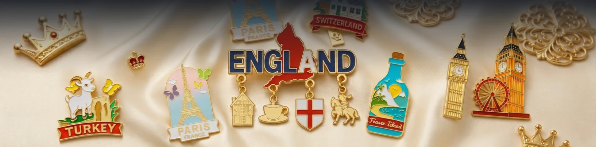
Enamel fills the recessed areas between raised metal rails with bright color. In soft enamel, the pigment sits below the top of the metal rails, leaving a slightly recessed, tactile surface. Hard enamel, by contrast, is applied in repeated layers, fired and ground flush until the pigment is level with the metal rails, producing a smooth, planar face. These two methods create very different looks for custom colored items, while the base artwork determines exactly which parts receive color.
A small dot of color often speaks better than a totally painted background. In our station example, color on the clock face grabs fast attention. It points out the exact mark that shows the old building. Bare metal next to the color gives needed visual resting space. An antique finish also suits projects that need a classic look; the darkened recesses then contrast with the brighter raised metal. The choice of soft or hard enamel, plating, mechanical polishing and antique finishes is matched to the approved artwork and intended style.
|
Design outcome |
Applied craft |
Visual characteristics on finished pieces |
|
Real world depth for tower motifs |
Carved metal paired with plain base surfaces |
Central subject sits dimensionally above surrounding elements |
|
Highlighted clock face details |
Localized enamel coloring |
Concentrated bright hues draw visual focus toward key motif |
|
Sharp definition within understated scenes |
Antique surface finish |
Recessed dark tones separate raised sculpted shapes |
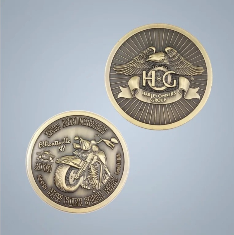
How the design becomes a finished coin
The art choices talked about above only reach the real item through a set making process. The approved drawing then moves through mold making and metal work. Then comes polishing, surface finishing, checking, and packing. Every step protects the link between the first idea and the finished item.
Mold development translates the drawing into relief
The making tool holds the shape that repeats across the whole order. In a stamping process, a steel mold holds a deep version of the planned raised design. Pressing that tool against a solid metal piece moves the art into raised and low areas. This way works well for designs with clean lines and medium depth.
Zinc-alloy liquid casting follows a different path. In hot-chamber die casting, molten zinc alloy is injected into precision steel dies, allowing intricate multi-layered 3D sculpture that cold stamping cannot achieve. The liquid metal fills a shaped hole. Because of this, the mold can make rounder shapes and deeper art than a flat stamped piece usually allows. The choice between these two ways depends on the base metal and the planned depth.
Edge finishing prepares the coin for decoration
Shaping leaves a metal piece that still needs work. Cutting takes away extra metal. Sanding fixes sharp edges, and polishing smooths the surface. A shaped edge is a planned design choice. It is not just a late thought. These steps make the item nicer to hold. They also give plating or paint a clean face to stick to.
Plating and enamel establish contrast and texture
Plating changes the bare metal surface. Paint adds color to picked areas. Soft enamel leaves the color below the raised metal lines. This makes a bumpy surface. Here, the metal edges are easy to feel. Hard enamel gets rubbed flat with those lines. This gives a much smoother face. The finishing order changes based on the paint method. Soft enamel usually comes after plating. Hard enamel gets filled, baked, and rubbed before plating. For a custom challenge coin, this order decides if the final face feels carved or smooth.
The border leaves room for the image
Words need much more space than the letters alone suggest. Long inscriptions arranged along outer borders compress available space for central imagery. The space between the words, the outer edge, and the middle picture gets very small. On the other hand, a short phrase often brings back that useful open space. Showing the full name might be very important. If so, placing it on the back side works well. There, it stays completely whole. It does this without crowding the front side.
Different edge styles give the border different amounts of visual weight. A plain, flat edge acts as a quiet frame. This works great for a front side with lots of details. A reeded edge or a diamond-cut border adds another bold visual pattern. Your challenge coin design might show a very bumpy building. In that case, a careful comparison of that busy edge pattern against a plainer choice helps a lot.
A real physical sample makes checking the final finish much easier. It is much better than looking at a zoomed-in digital drawing on a screen. Light bounces in active ways across shiny and plated metal faces. Also, low spots react differently than raised parts. Sample making and art changes also come as part of the service. Because of this, the first drawing and the picked finish come together for review. This review proceeds with confidence before starting the big production run.
The detail that stays with someone
For this railway station example, the main goal is simple. A person sees the clock tower and instantly knows its meaning. Any extra art naturally supports that exact moment of knowing. Design elements that fail to reinforce the core theme reduce the visual impact of the finished metal piece. Enough space goes to the most important mark. Just enough words also explain its big meaning. This method feels much more personal than a design stuffed tightly from edge to edge.
Making a first drawing sometimes benefits from a helping hand. For any thoughts or questions, feel free to contact us at any time.
FAQ
What makes a custom coin design unique?
Real identity comes from a certain part linked right to the event. A known local building, an important sign, or a big date gives great focus. This works much better than random shapes put around a basic company logo. Special production selections bring visual emphasis to central motifs. These include soft paint, hard paint, or old-style antique finishes.
What belongs on the back of a challenge coin?
Important dates, helpful words, and extra pictures fit perfectly on the back side. Putting this extra info on the back face is very helpful. It totally clears up the front side for your main picture.
Does every challenge coin need 3D relief?
3D relief delivers distinct visual outcomes across different motifs. Complex subjects such as architectural structures and human features gain dimensional presence from carved metal surfaces. Two dimensional artwork with crisp metal borders delivers clean presentation for text and simple symbols.
How much text fits on a custom coin?
A strict word limit gives very little help. Real sizes and visual setups change a lot between projects. The picked text size, letter spacing, and close pictures finally decide how easy it is to read. Reviewing artwork at actual physical dimensions exposes areas of dense visual density. Doing this makes crowded areas much easier to spot and fix.
How do enamel and antique finishes differ visually?
Paint adds bright color to certain picked zones. A soft enamel method leaves the painted parts slightly below the raised metal edges. On the other hand, hard enamel gets rubbed totally flat. This makes it level with the metal lines. An antique finish creates a classic, old look. It does this by boosting the visual difference between dark low spots and bright raised metal. Each different way makes a unique visual result. Complex layouts integrate multiple finishing techniques per approved project specifications.