Why Small Design Details Matter in Custom Challenge Coins
Time : Sep 17, 2026 View : 82
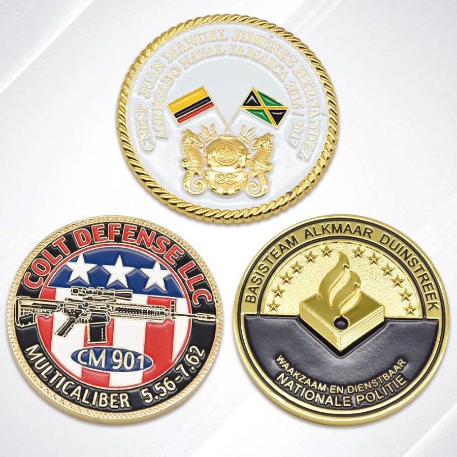
A challenge coin often earns approval because the artwork looks impressive on screen, yet loses part of its identity once translated into metal. In production, fine lettering sometimes closes up. Narrow borders lose definition more easily, while shallow relief stops catching light effectively. The central design question is therefore not how much detail fits into the artwork, but which details survive the transition from artwork to metal without losing definition.
Key details must remain clear at actual coin size
A challenge coin is encountered at close distance, but not as a flat digital image. The rim and weight register first in the hand. As the coin turns toward the light, the strongest symbols take visual priority. That makes hierarchy essential: the emblem, wording, edge treatment, and secondary marks need separation.
The most successful custom challenge coins do not give every line equal importance. Relief, spacing, borders, and surface contrast guide the eye. When a design includes a unit mark, corporate identity, date, rank, or commemorative phrase, the visual hierarchy needs to make the primary message immediately legible.
Four design decisions protect clarity
Relief requires clear separation
Relief adds tactile and visual depth, but closely spaced raised areas reduce definition. Clear separation around lettering and small symbols helps individual elements remain distinct on the finished coin. A clean silhouette often creates more impact because its edge remains visible in changing light.
Lettering must remain legible after production
Text is especially vulnerable during production. Fine strokes, tight spacing, and long phrases become difficult to read after production and finishing. Shorter wording and sensible spacing usually perform better than shrinking type until everything fits.
Borders separate the main field from the rim
A border creates a stable frame between the main field and the rim. After polishing, electroplating, or coloring, enough width and spacing help that boundary remain visually distinct. When the border sits too close to the artwork or becomes too narrow, it competes with the emblem for visual space.
The reverse side requires a separate layout review
The back of a coin often receives less attention during the first sketch, even though it frequently carries the date, motto, organization name, or recognition message. A balanced reverse keeps secondary wording organized and reduces the risk of cramped text.
For teams developing custom challenge coins, these choices belong before mold development begins. Mold development translates the approved design into production tooling, so lettering, borders, and negative space are best resolved before that stage begins.
|
Design area |
Common risk |
Better review question |
|
Main emblem |
Shape becomes crowded |
Is the symbol recognizable at a glance? |
|
Small text |
Strokes close or lose contrast |
Does the wording stay readable after finishing? |
|
Border |
Frame competes with artwork |
Does it separate the field without stealing attention? |
|
Reverse side |
Message feels compressed |
Does the back have a clear hierarchy of its own? |
Material and finish change how details are seen
The same artwork reads differently across zinc alloy, copper, iron, and stainless steel, while surface treatment changes the way relief responds to light. Electroplating, polishing, enamel coloring, and epoxy coating all influence surface contrast and definition.
Not every design needs an elaborate process combination. The right finish helps the intended message read clearly and remain consistent across the batch. Gold Valley’s process covers mold development, polishing, electroplating, enamel coloring, epoxy coating, and quality inspection. Sampling then reveals how form and finish work together on the physical piece.
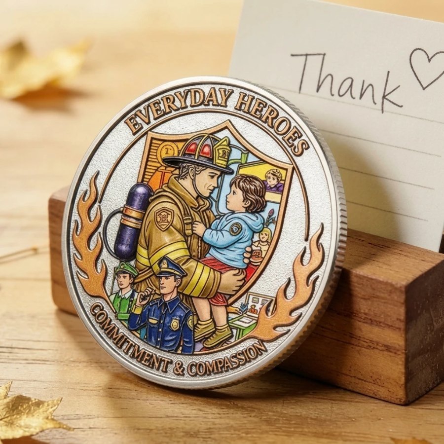
For custom commemorative coins, a restrained finish keeps the date or dedication visually prominent when it carries the main emotional weight. A recognition coin built around a dominant emblem gains clearer separation from stronger relief and well-defined edges. The point is to match process choices to meaning rather than treating finish as a late decoration.
A custom challenge coin manufacturer treats artwork, mold development, finishing, and sampling as one connected production sequence.
The same review logic fits custom-made challenge coin programs for recognition, membership, commemorative, and event use.
Sampling turns an attractive idea into a shared standard
A physical sample reveals differences that remain unresolved in a rendering. It allows the produced piece to be compared directly with the approved artwork before production approval. For larger recognition programs, several samples viewed together give a clearer picture of production consistency.
Gold Valley supports design assistance, visual renderings, dedicated mold development, sample production, and modifications before production approval. Spacing, relief, and finish changes remain tied to the approved artwork throughout sample revision.
A reliable sample discussion separates design issues from manufacturing issues. Crowded artwork points to a design revision; rough or inconsistent surfaces point instead to process control and inspection. That distinction keeps revisions focused.
A practical detail check before release
A concise sample review keeps the discussion focused on visible production results:
- The main wording and date remain legible on the finished sample, not only in the digital artwork.
- The smallest important symbol remains recognizable at normal hand-held viewing distance.
- The rim and raised areas feel clean, without distracting roughness or weak transitions.
- Relief and finish retain clear definition under ordinary light.
- Multiple samples show consistent color, electroplating, edge definition, and overall balance.
For bulk programs, this review helps the design team, factory, sourcing team, and inspection staff check the same visible criteria before release.
The practical takeaway
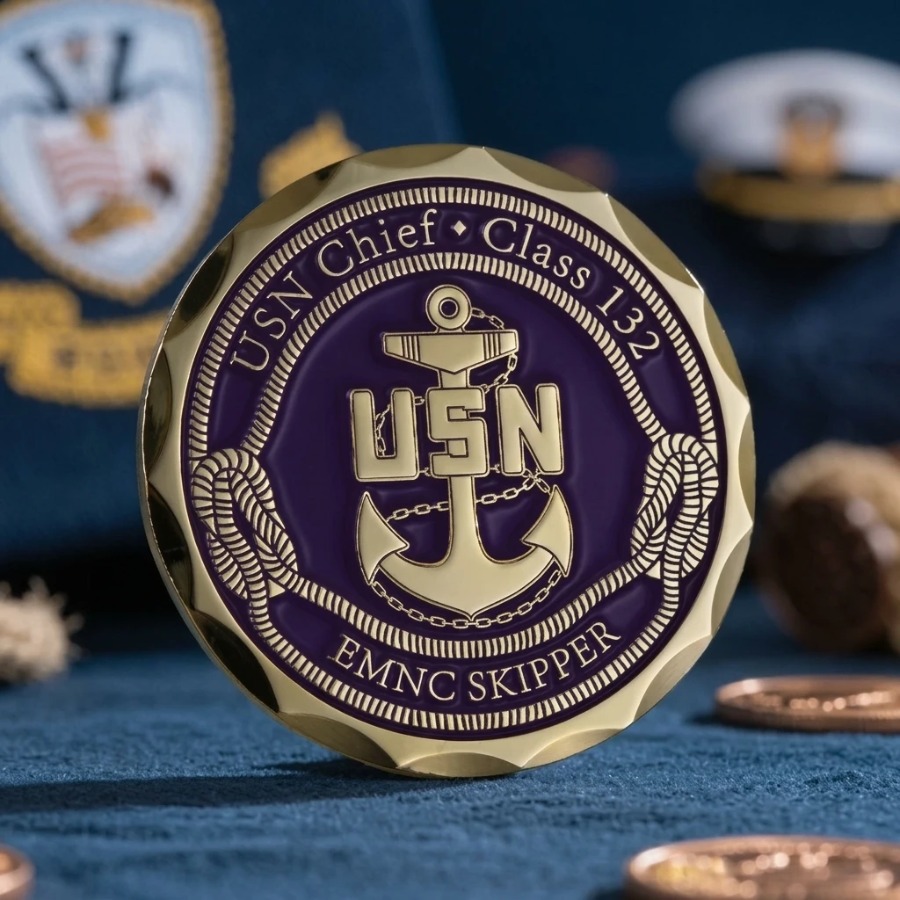
The strongest challenge coin is rarely the one carrying the most information. Its value comes from preserving a recognizable identity after artwork becomes metal.
Once the physical sample preserves that identity without visual crowding or weak surface definition, it provides a practical benchmark for production.
For custom corporate challenge coins, that benchmark helps keep production aligned with the approved design.
FAQ
Why do small details matter on a challenge coin?
Small details carry names, dates, symbols, and identity. When they merge or disappear, part of that meaning disappears with them.
How much text works well on a challenge coin?
Use only the wording that supports the coin’s purpose. Shorter text with stronger spacing is usually clearer than a long phrase compressed into a small area.
Are design revisions possible after sampling?
Yes. Gold Valley’s customization process includes sample review and modification before production approval. Revisions remain tied to the approved artwork and sample standard before mass production begins.